Wicked Fast Data Product Prototyping

Wicked Fast Data Product Prototyping

A perfect storm has been brewing and enabling my passion for rapid data prototyping. Clusters have grown to handle a year+ of data in minutes to hours. Company’s investments in ETL pipelines make big data small – going from feasible O(n) to O(n^2) algorithms is phenomenal! And, javascript libraries have started tapping into 3D interactive data visualization. As these advancements continue, what is now possible with two days of development is mind boggling, inconceivable! I can not resist. All tolled I’ve done 14 hackathons and prototypes for novel data products. To date four are used in production at Yelp and LinkedIn, and three are on-deck.

Thank you LegoThat is a hard won success rate. Data prototypes are particularly vulnerable to early dismissal compared to product, infrastructure, or design prototypes. When surveying results it is easy to imagine if the elements of a page were better aligned or if the infrastructure ran on more machines. For data products, it’s hard to imagine if search results were added that are not on the page. It’s hard to imagine data that is not there.

Here are the recommendations I sweat blood to learn. Many of these recommendations may seem small, but details are vital. You will be amazed at how practice and experience change your interpretation of them over time. To set your data product up for success, without further ado:

Days before Hackathon:

  • Sketch all the components before you begin and fit components to people
  • Pre-generate and store the baseline data set required for your product to work. This is key as online data generation will frequently fail for prototypes and hamstring your demo. By limiting your demo to employees, you can precompute and store data in a temp database to mimic real time computation.
    • Sanity Check the data density and quality for special users, such as your team and ceo
    • Use basic metric checks to check data quality
    • Have a default data set that loads in the event of a database or data error. This will let you showcase front end work in the event of an error.
    • Personalize! You have a baseline data set and algorithm, setting parameters such as font size, category preference, on a per user basis will take your product to the next level.
    • White list for employees and people who will be at the demo day. Make sure it is a recent list of employee ids.
    • Plan on the Hadoop clusters being overwhelmed during the hackathon, particularly for summer hackathons with interns
  • Model – keep it simple – complex models require tuning and large amounts of training data

Day of Hackathon:

  • Set your prototype up so that a reboot requires one command and takes less than five minutes
  • Do not randomize! It can be tempting for team members to try and make an algorithm look smarter than it is by faking it. When it succeeds you can not say why and when it fails it really fails.
  • Visualize the data in a novel and productive manner; demos of weights in a model don’t impress
  • Spring board – use platforms available internally – hosting, id verification, etc
  • Mobilize – ideally set the demo up on loaner phones; at least address how the product works on mobile
  • Record user interactions. This can be done with simple http request tracking or by adding url parameters like ‘&our_awesome_hack.’ I particularly like url parameters, as the interactions your product drives with the rest of the site are then stored with the company’s data and you have access to all of your daily tools to run follow up analysis.
  • Organize – for teams of three or more sit in the order of dependencies from backend to frontend. This way api and blocker discussions are easily facilitated.
  • Choose a central host server and set the permissions to be as accessible as possible. Double check the host has reliable connections, exceeds memory and processing requirements, has all necessary installed packages, and is not running any other processes.
  • Six packs of Black Butte Porter and Martinelli’s. A successful data hackathon has all data generated in advance. If you are the data person, take on the role of Scrum Master. Handle all unexpected tasks, research special requests, and organize stress relief breaks for the team.
  • Details, details, details. Use every last minute to refine css, html, adjust margins, and reduce load time. Each of these details should not affect rebooting the prototype within five minutes and should be tested after each change.

Days after Hackathon:

  • Present how many people accessed your prototype, what their responses were, what you learned, and what is necessary for productionizing
  • Reflect. Ask yourself the hard question. Should this product go to product or not.

While this may seem like a long list just for a hackathon – data product prototypes fail fast. Having results off for the one person responsible for sourcing, is equivalent to summoning the coroner.

Measure Me.

Measure Me.

Launching a rocket ship, or a new company is a bizarre experience. There is the rush of rapidly completing major stages: Delaware c-corp status, app store release, press release, subscription packages, customer #1, ad #1, investor #1, the milestones just keep whizzing by. Then there are the hard questions not answered quickly. Is this a product people want? How engaged are people with the app? There are two groups who want to know the answers: investors and you.

playlearnparent.com

An investor happy with stickiness.

Answering these questions for investors is fairly straight forward. Investors like using a familiar measuring stick across companies: page views, daily active users (DAU), monthly active users (MAU), and/or revenue. If you remove the graphics, that’s what the earnings reports are for Facebook, LinkedIn, and Twitter. But the original questions remain: Is this a product people want, and if so, how much do they want it? To approximate the answers, investors calculate secondary metrics such as page views per member, stickiness (DAU/MAU), revenue per member, etc.  Most are straightforward economics metrics, but I recommend caution when using the stickiness metric. The best ‘stickiness’ is achieved by a company with 1 user who visits every day. If I asked, my mum would oblige.

Now for the tough question, with the toughest critic: yourself. When guiding your product or company, how should you measure user engagement? Choose wisely. Once you define a metric for user engagement, that metric will be owned by a product team who will maximize that metric in ways you never thought possible. If you choose the stickiness metric mentioned above, it will be Mother’s Day 365 days a year.

In general there are two lines of approach for engagement summary metrics: bottom up and top down. A bottom up approach entails measuring every activity a user could do with your product and counting interactions. If you have a basic text messaging app, users can send messages and read messages. A pretty reliable metric then is \lambda\|Sends\| + (1 - \lambda) \|Reads\|. Use correlation coefficients between sends and reads for long term user engagement to chose \lambda. This approach can rapidly get away from you as your app or site increases in complexity.

Know your options.

Know your options.

For the top-down approach we can tackle measuring user engagement by first solving another tough problem. What is the vision of the perfect user experience with your product? Ideally, this is a question asked in the design phase of the product, but if not, or if the vision has morphed, no worries. Take the time to ask it now. Once the vision is well articulated everything else is simple.

Example 1, short term vision: Let’s say our product is a news aggregator and the vision is to provide valuable content to members everyday. The top level engagement metrics are going to be along the lines of number of members reading news on 5 of the last 7 days, number of members who interacted with a news article today, etc.

Example 2, long term vision: Let’s say our product is a real estate site and the vision is for members to buy a house through our service. If we captured 10% of San Francisco’s homes sales, that would be 11 sales a week. That metric is too sparse to be reliable. For a stable metric, we need to utilize early indicator signals for eventual conversion. Enter data science. I can not predict what the actual metric will be, but it will be of the format \sum w_i Action_i, a weighted sum over the actions users can take.

Engagement metrics can seem elusive, but a vision is a good place to start.

Thanks to imgflip.com and sparkpeople.com

For continued reading:

Mean Average Precision isn’t so Nice.

Mean Average Precision isn’t so Nice.

For search algorithms, Mean Average Precision(MAP) and its variants rule the roost of metrics on search dashboards. MAP is also one of the most stubborn metrics with which I’ve ever worked. I’ve seen dramatic algorithmic improvements launch themselves into the +0% impact on MAP experiment graveyard. …………but does MAP measure what we think it does?

Search quality or information retrieval is built on two cornerstones, give me everything I want and give me only what I want. It is easy to measure these aspects of search quality with Recall (proportion of everything that is recovered) and Precision (proportion of good stuff returned.)

Ideally we could have perfect Recall and perfect Precision. In the absence of perfection, it’s nice to know how close we can get. Then we can run experiments and march towards an optimal search algorithm. Enter Mean Average Precision (MAP). MAP combines Recall and Precision into one number. If MAP is 1, you have achieved perfection. If MAP is 0, delete your search algorithm and consult Stack Overflow. Let us take a look at what MAP means when it is somewhere between 0 and 1.

To visualize a metric, let me rustle up a skeleton in the math knowledge closet. Contour curves, level sets, elevation maps, and topography maps are all the same thing. In short, they are visualizations where any two points connected by a curve have an equal value. For jogging the memory here is an elevation map of Halcott Mountain. Any two lat/long coordinates connected by a red line are at the same height above sea level. The red dots outline a path from the base of the mountain to the top. The more rapidly a hiker crosses red lines, the steeper the trail.

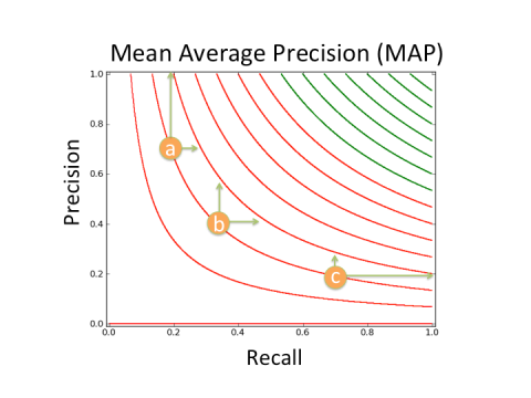
Now it’s plug and chug time! We can do the same for MAP. Let us say latitude now represents Precision and longitude represents Recall. Any two lat/long or Precision/Recall points connected by a line have the same height or MAP score (green lines represent better MAP scores than red lines).


Gorgeous! What does it mean?

For most search algorithms, they will have a MAP score that puts them on the most curvy of the lines, either with Precision < 0.3 or Recall < 0.3. Search is a hard problem. To go back to the mountain analogy, if you want to ski down the mountain as quickly as possible you want to change elevation as quickly as possible, in other words cross contour lines as quickly as possible.

Let us consider a common set of values:

  • Precision > 0.3 (~clicks occur on the first 3 results)
  • Recall < 0.5 (~1 in 2 searches results in a click)

then

  • For some values a 1% improvement in Recall is the equivalent of a >150% improvement in Precision!

For a visualization consider the three points marked in the figure. If an experiment improves Recall, it will have half the impact on MAP at point b as it does at point a, and a fourth of the impact at point c as it does at point a.

Sample MAP points

Points a,b, and c all have the same MAP value. Vertical green arrows are how much Precision would have to increase to have the same affect as the increase in Recall marked by the horizontal arrows. The shorter the arrow the easier to achieve. The long arrows are particularly hard to achieve.

That’s nice. Why does it matter?

It means MAP is not measuring what we think it does! In regions common for search algorithms to score, good changes in Mean Average Precision, MAP, are from either changes in Recall or Precision, but not both! In short, a search team seeking to improve MAP may waste resources on experiments with good returns in Precision, miniscule returns in Recall, and consequentially no returns in MAP.

Footnote: a similar exercise can be used to show that Discounted Cumulative Gain (DCG) and other MAP variants inherit these characteristics as well.

Courtesy of imgflip.com

Magic + Data Science

Magic + Data Science

On occasion I need to define data science in a talk. If you want to provide an encompassing politically sensitive definition, it is no small task. I have not heard such a definition yet. But taking a step back and working with my target audience, I was surprised how well a Magic card could capture some of the subtle complexities of data science.

Thank you Disney and mtgcardmaker

Thank you Disney and mtgcardmaker

Data scientists mostly encourage growth, but on occasion advocate for the removal or archiving of a product. Data scientists are expensive and rare. Finally, data scientist have massive offensive power for tackling analysis and guiding company decisions, but poor defenses. It is particularly easy for talented data scientists to switch companies in the breeze.

2020 Housing Projections

2020 Housing Projections

If everyone made a list of their headaches with living in San Francisco, it would include crime and housing. To Mayor Ed Lee’s credit he frequently addresses these concerns at rallies and in public speeches. But forgive me a moment, I can not let the campaign video of a lifetime slip into oblivion:

So, Mayor Ed Lee can put on a cool guy persona. Let’s see if his housing promises can cool this lava hot housing market.

In the State of the City address, Mayor Ed Lee promised to add 30,000 housing units to the market by 2020.

For comparison One Rincon Hill, the tallest residential building in San Francisco at 641 feet tall, and a notable addition to the skyline, holds 376 residences. It would take an additional 80 buildings of that size to meet Mayor Ed Lee’s promise. In the last 44 years, San Francisco has only built 7 buildings of that size. Could the Mayor have over promised?

We take a look at the data from another angle. There are 376,924 housing units in San Francisco as of 2012 with 31000 listed as vacant. If all vacant housing units are refurbished and put on the market, then the Mayor can keep his promise!

I’m always happy when it can be shown that political promises are feasible. The next question to ask is, given the Mayor could add 30k housing units to the market what will the impact be on housing prices?

San Francisco Housing:

lion